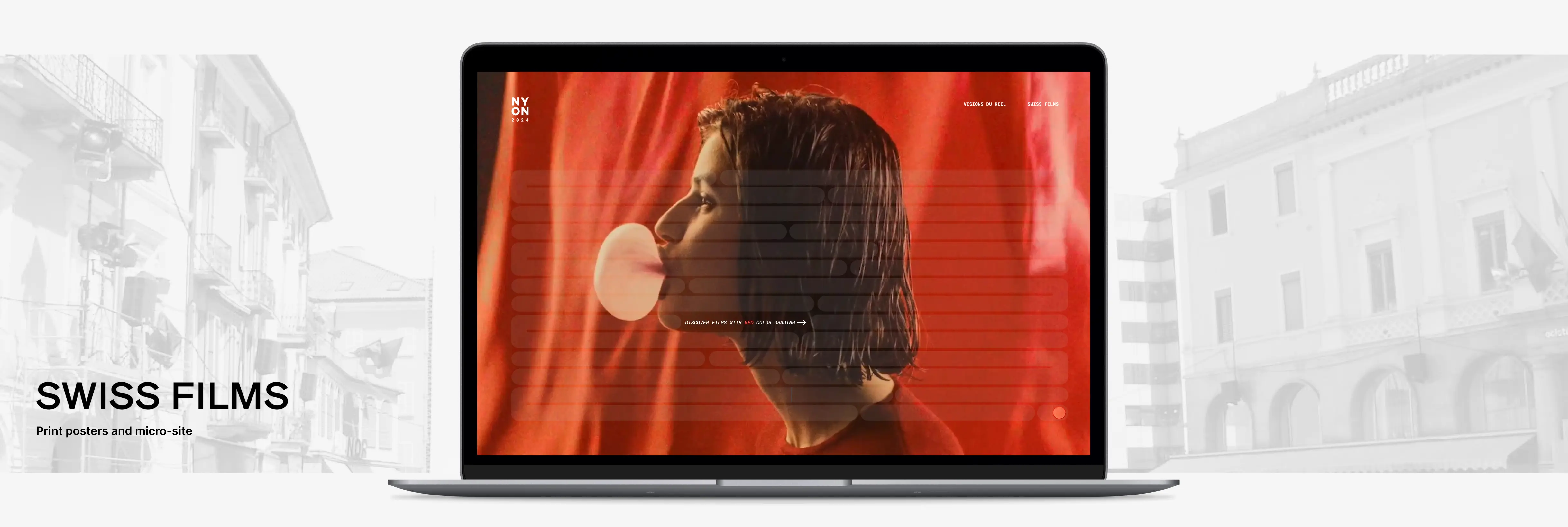
The Swiss Films Foundation is an organization that promotes Swiss filmmaking and cinematographers, to support the recognition of Swiss film across the globe. Visions du Réel is an internationally renowned film festival held annually in Nyon, Switzerland. This final artifacts of this collaborative project were promotional materials for Visions du Réel at the Swiss Films Festival: two posters and a prototype of a micro-site. The central objective of the project was to apply design qualities derived from the graphic designer Chris Ashworth, and principles gathered from Ellen Lupton's text Graphic Design: The New Basics to the design process.
3 weeks
The premise behind the promotional campaign for Swiss Films and Visions du Réel was to emphasize colour and its importance in cinematography. A collection of themes were defined for a series of select short films, exclusively in consideration of their colour grading. Mood is a direct consequence of colour grading in film, and this drove our approach to the content architecture and visual design for the final artifacts. The incorporation of abstraction into how this premise was conveyed was the main rule of the collaborative project, per the course instructor's brief. The video footage selected are not directly derived from the list of Swiss films intended to be presented at Visions du Réel of the year, but rather from a variety of existing movies and short films accessible online.
The print artifacts were the first component of the promotional campaign. The visual language was based off of the following design qualities, which were inspired by Chris Ashworth's graphic design work:


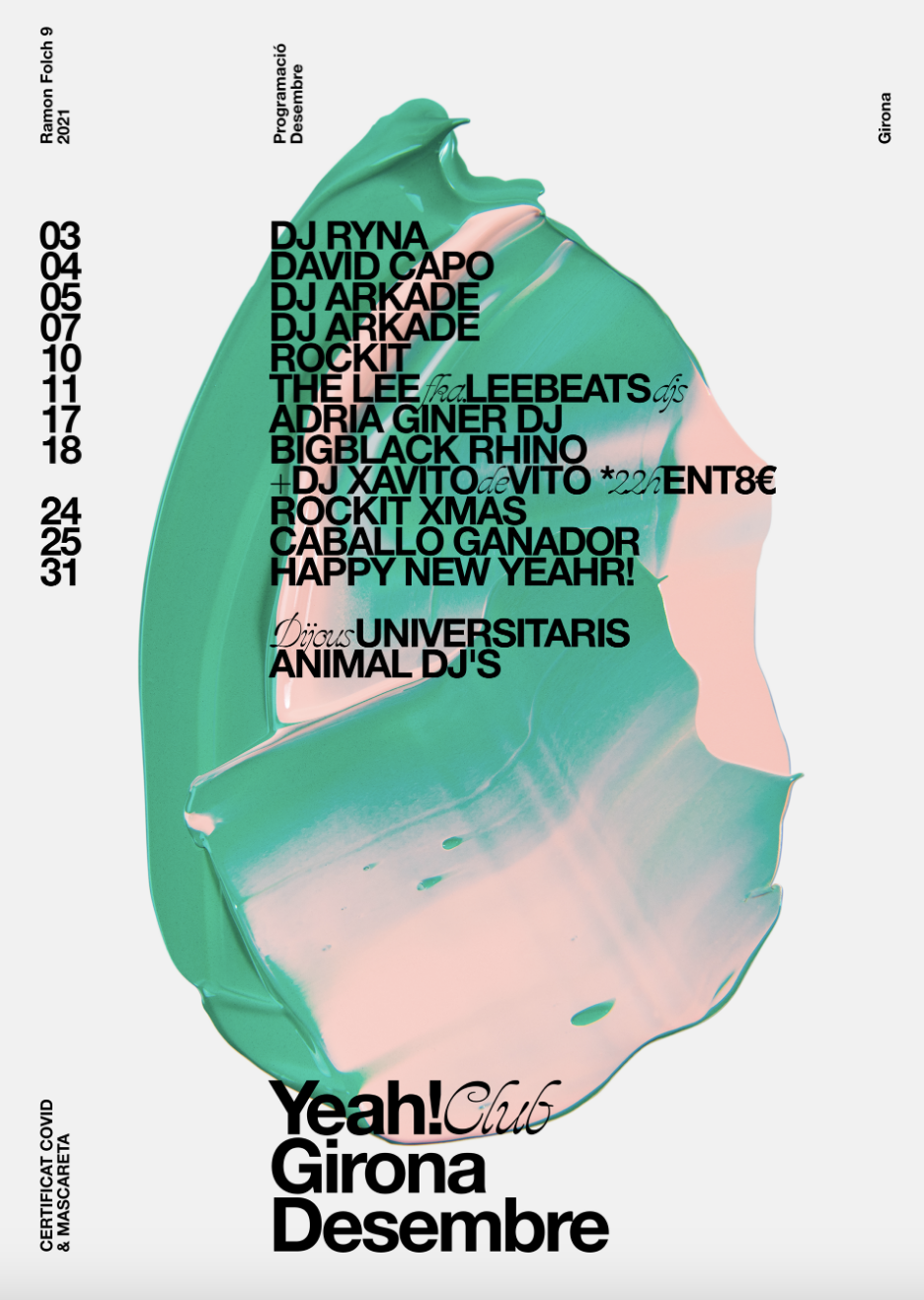
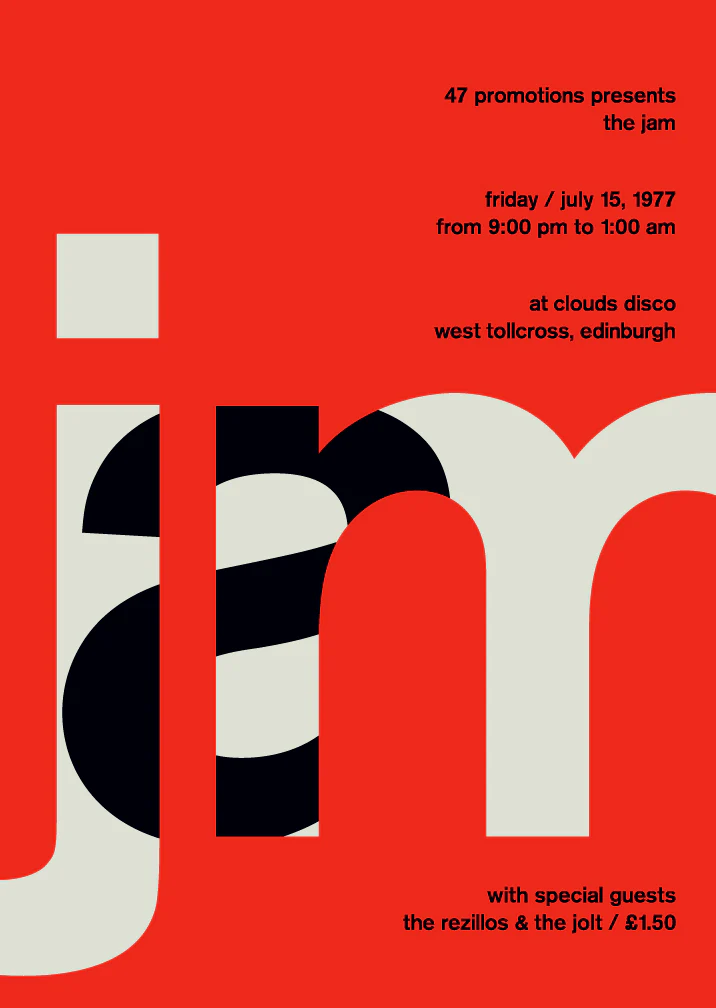
Some sample posters we looked at for inspiration in implementing the three design qualities described, in respective order.
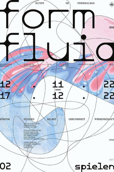
Existing poster inspirations from external sources, which illustrate the two Ellen Lupton principles that were referenced. Posters are organized in respective order.
The following principles derived from Ellen Lupton's principles were implemented:
Two posters were designed and then contextualized in real-world spaces. The design qualities are implemented in each poster, with a shared design language and visual identity. The consistent re-use of the same clusters of text is intentional. Shapes and images are emphasized with the effect of closure, which implements the design principle Using Proximity to Group Shapes and Text and Establish Hierarchy.
Transparent shapes between the two posters are merged with clusters of spliced letters, which appear to blend the foreground and background elements. These design decisions illustrate the design qualities Splicing Text to Alter Legibility and Change Meaning and Transparency for Merging Foreground and Background Elements.
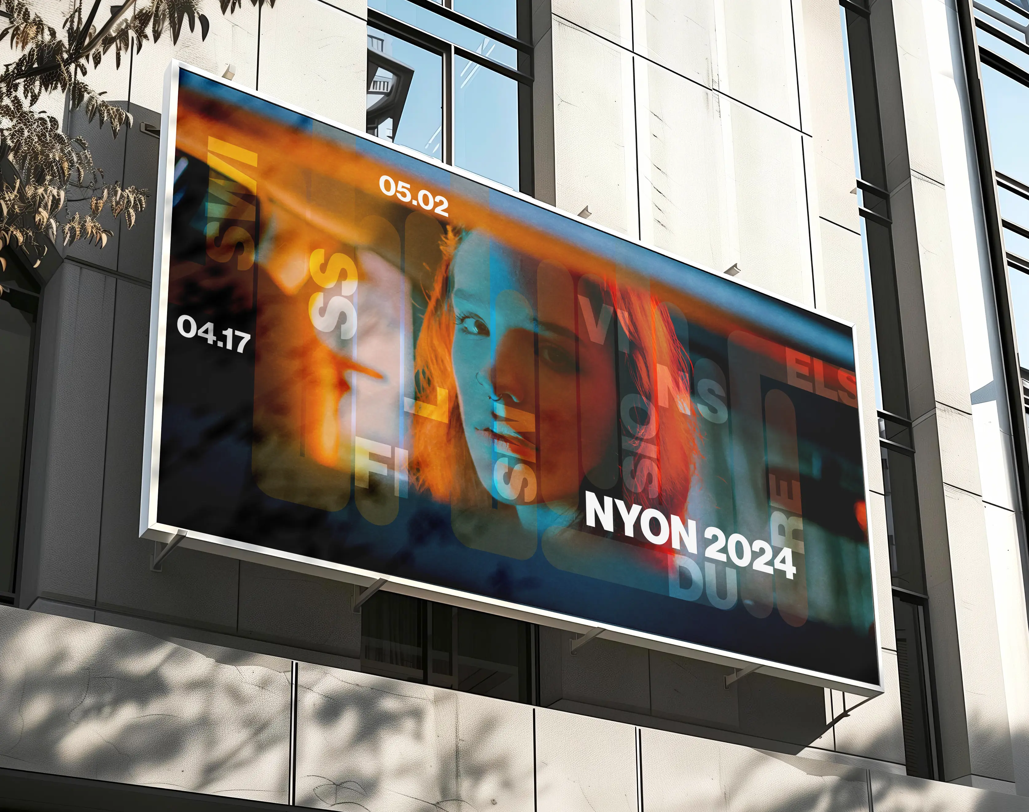
A horizontally-oriented promotional poster for the Swiss Films Festival.
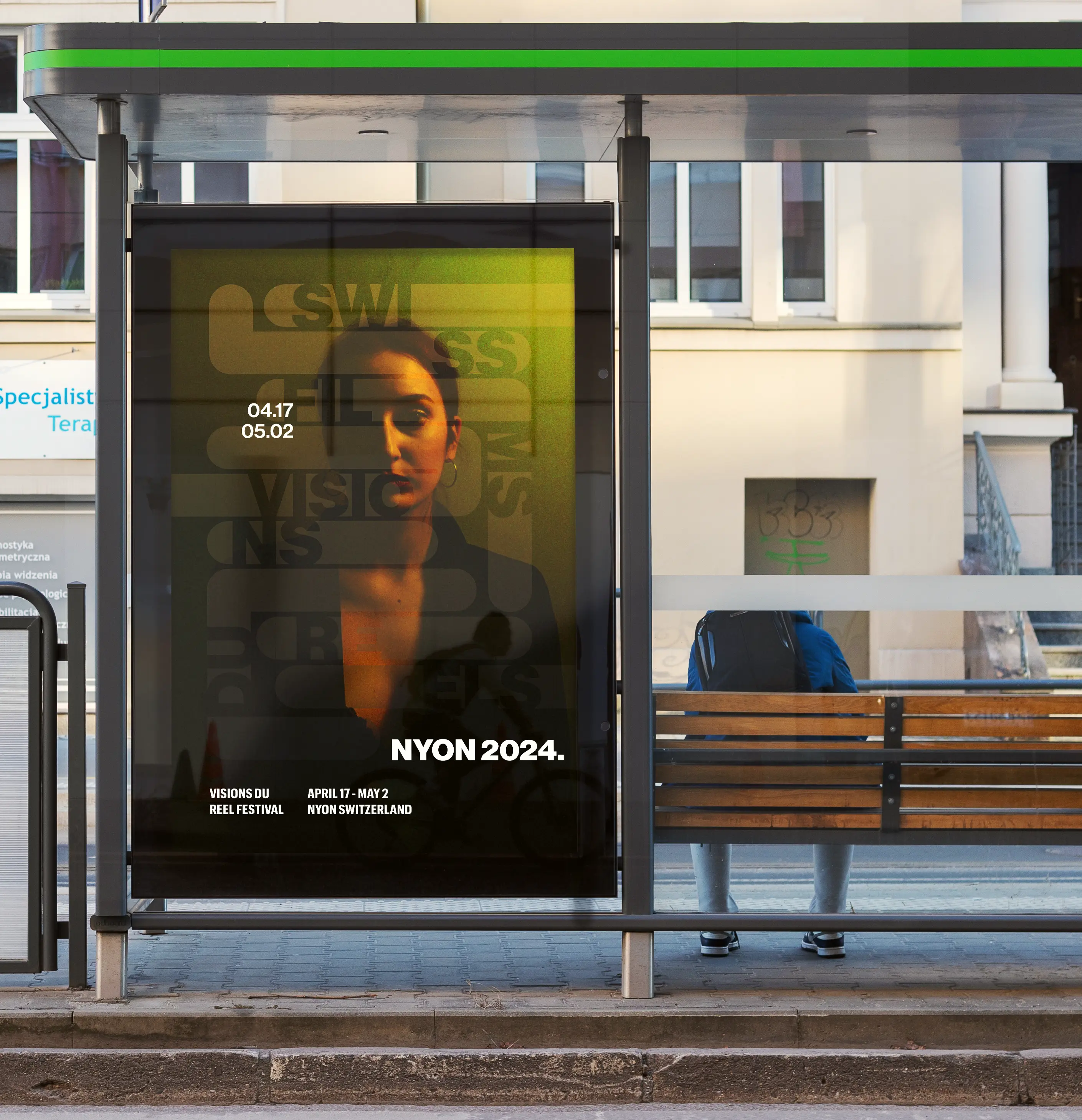
A vertically-oriented promotional poster for the Swiss Films Festival. Intended to replicate the visual components of the horizontally-oriented poster.
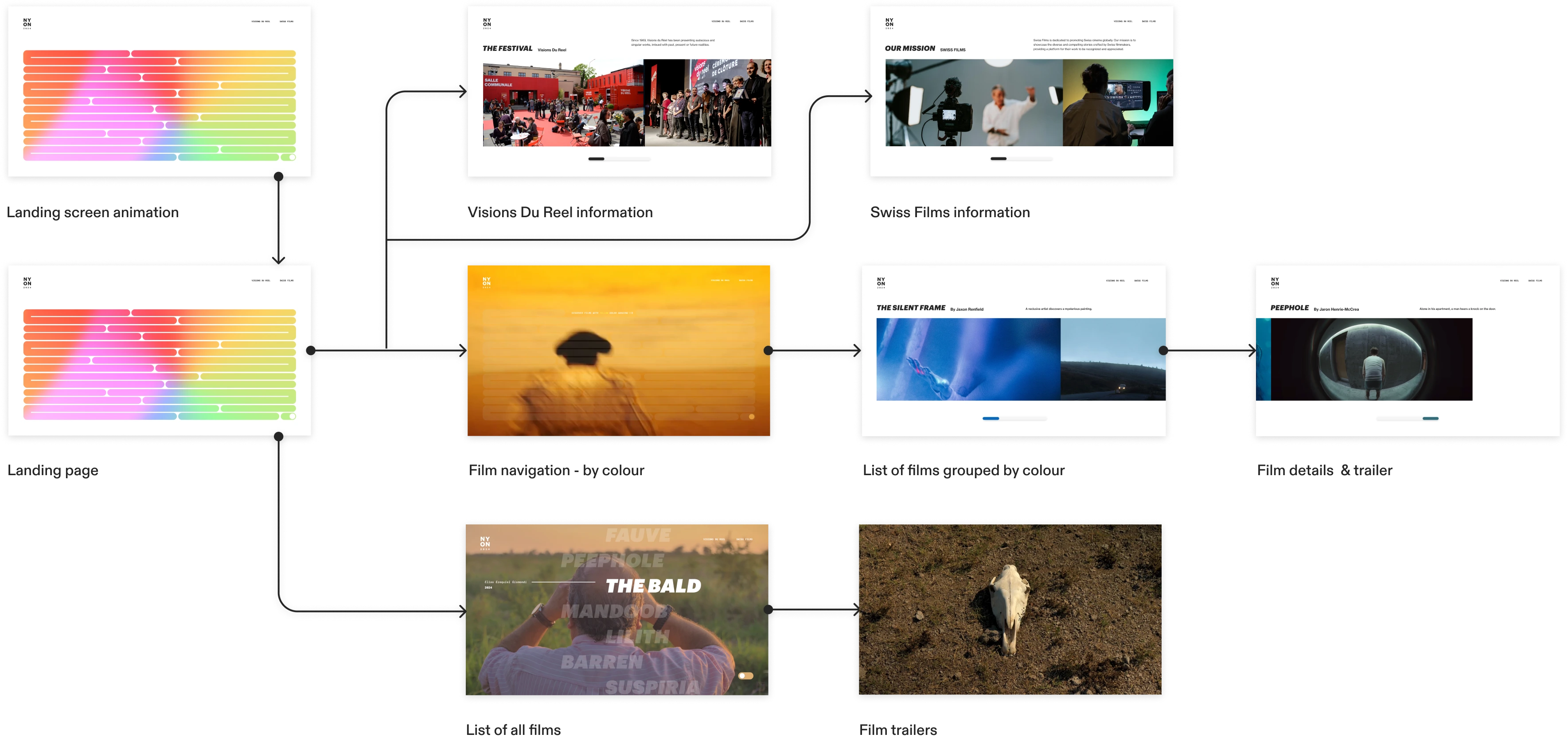
Incorporating the same visual elements of the promotional posters, the micro-site further expands on the premise of the celebration of colour with additional visual and textual content. The abstract navigation experience on the landing screen incorporates the premise of a colour palette. While they exist in the same micro-site, there are two distinct navigation experiences the user can toggle between, to accommodate users interested in simply navigating through a list of short films without considering colour grading. The sitemap visualizes the structure of the micro-site.
The default navigation experience is intentionally abstract, providing a unique user experience while simultaneously maintaining the micro-site's emphasis on colour grading in film.
The list of relevant films are listed without any consideration of colour grading. After selecting a specific film, the trailer for the film will auto-play after a couple seconds of delay. The user can toggle back to the main navigation screen at any point in the experience.
The experience of incorporating an artistic sense of abstraction into micro-interactions for a prototype was highly rewarding. Presenting relevant content in a truly unique way while also ensuring the message and functionality of the content isn't lost can be difficult. Another challenge was maintaining the same visual language between the promotional posters and the micro-site in a meaningful way, that did not get lost in unnecessary ornamentation. Utilizing transition animations and micro-interactions in the micro-site prototype brought life to the visual components of the posters, while maintaining the central theme of colour grading.
In consideration of the fact that abstraction was the main objective of the course project itself, the final prototype was successful in how it abstracts the relevant content and imagery in a meaningful way. The skills that I have developed and will carry over from this experience derive more so from the emphasis on impactful imagery and video. While designing website frames and prototyping the interactions were crucial to the final execution of the micro-site, the visual content that was presented pushed the value of the micro-site further. A focus on the consistency of the visual language between all of the deliverables collectively was crucial for the success of this project.