
Avalanche Canada is a Canadian non-profit organization that seeks to support the public safety of backcountry enthusiasts during the winter season, especially in areas that are prone to avalanches. The backcountry refers to rural, uninhabited areas, and in the context of this case study - primarily in snowy terrain.
4 weeks
Avalanche Canada currently has an existing mobile app AvCan that provides an Explorer feature that visualizes avalanche forecasts in the user's selected region, in addition to the option to submit and access existing MIN (Mountain Information Network) reports. Building upon the AvCan app was foundational to the objective of the design project. The approach had to be meaningful and useful to the target audience - backcountry enthusiasts - and supportive of their safety in avalanche-prone backcountry terrain.
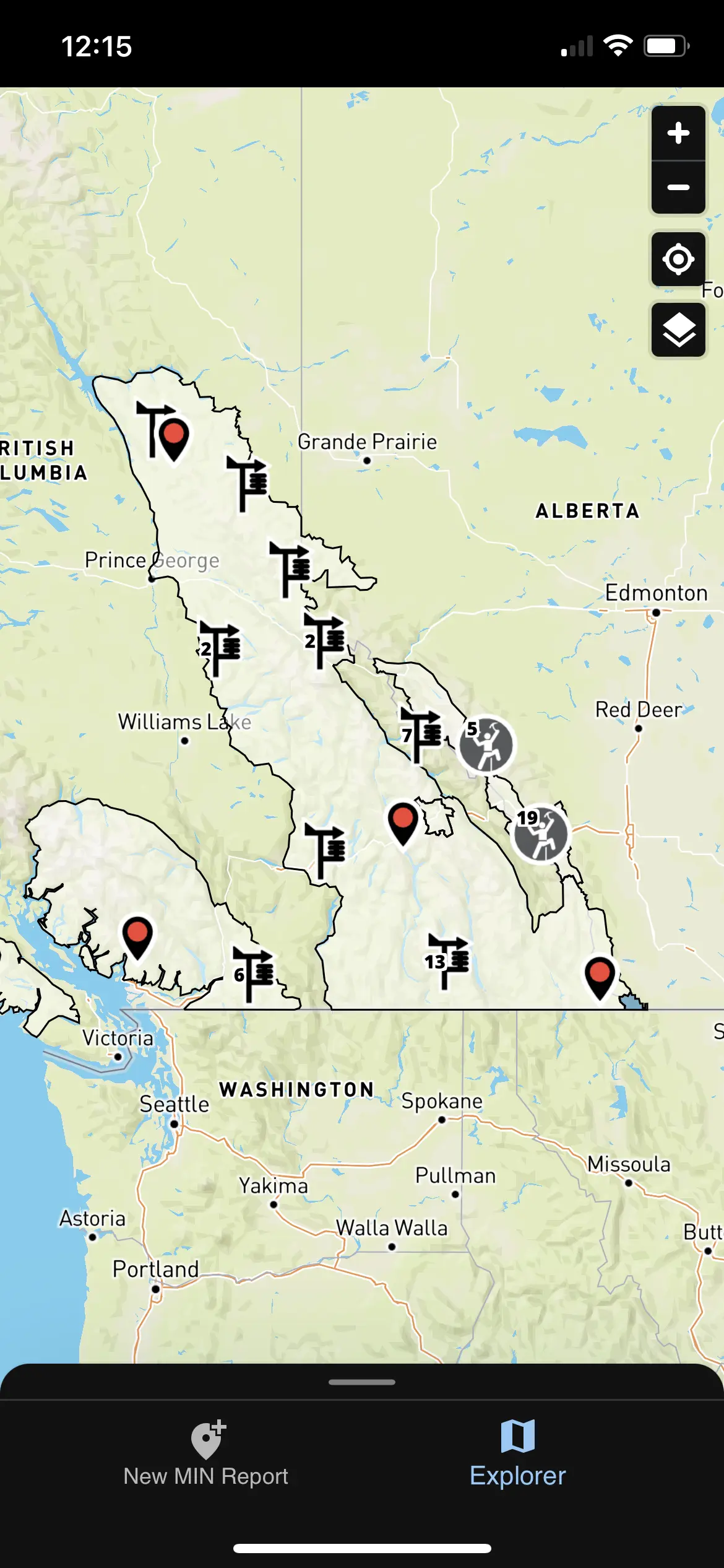
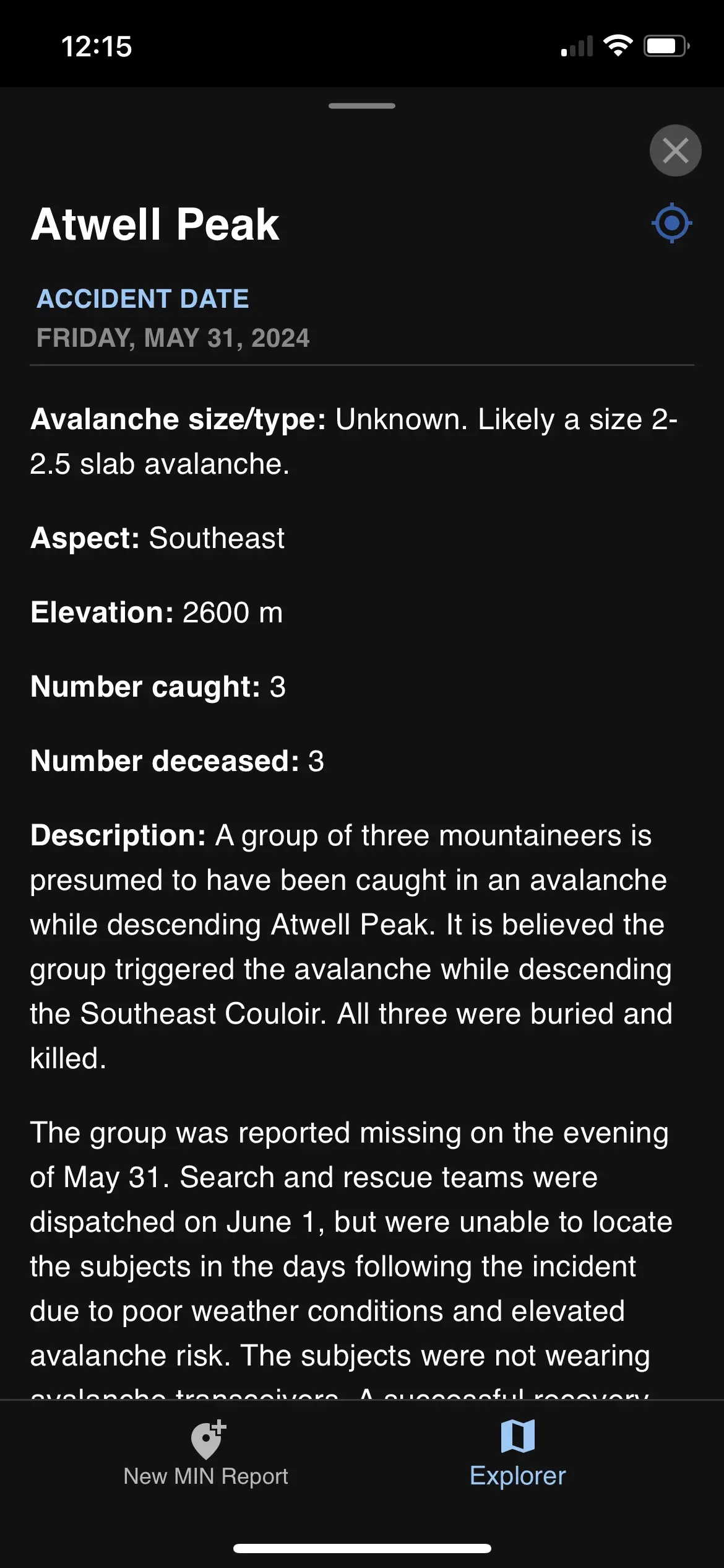
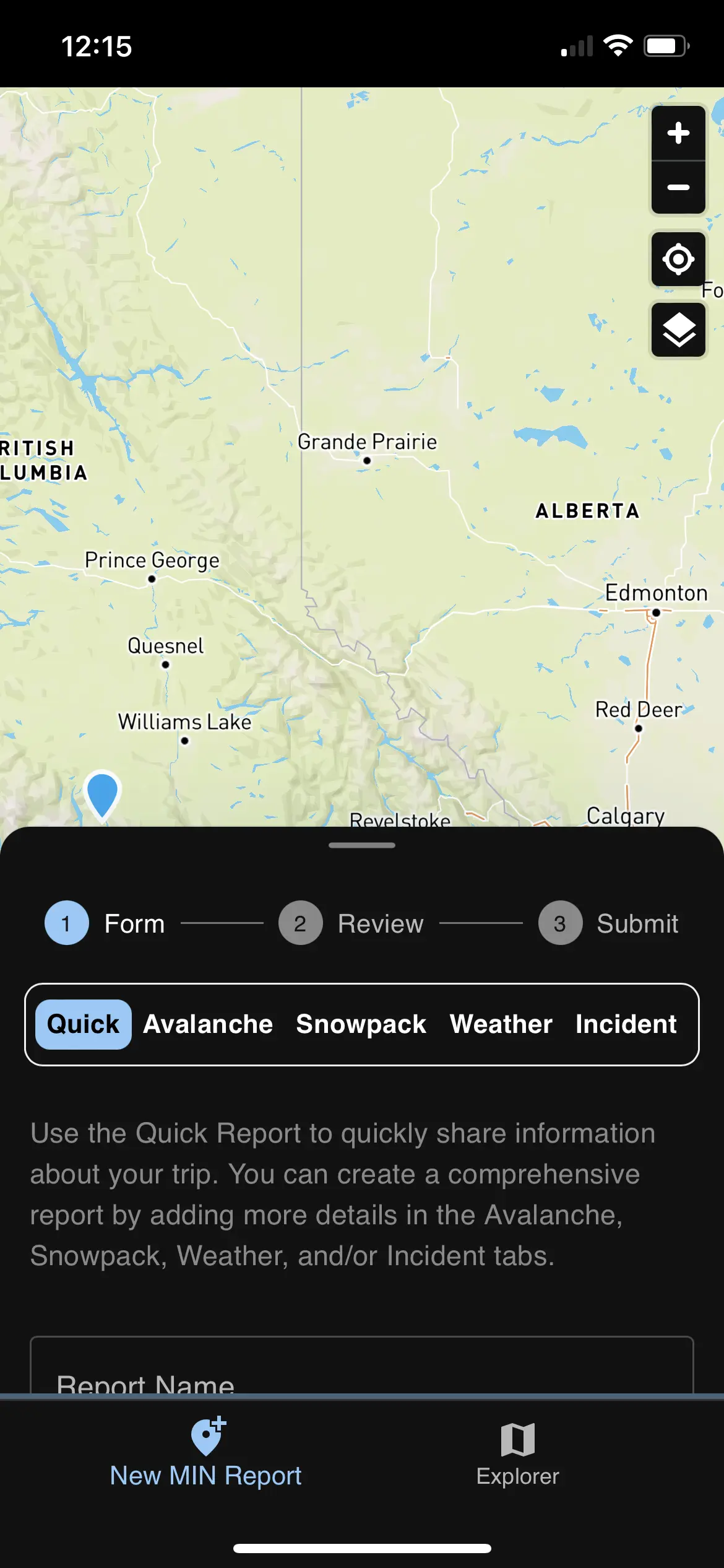
Screen captures of the existing AvCan app and its present features.
There was a need among the users we interviewed for resources that are quick to access, navigate, and understand when out in the backcountry, that can also be accessed offline. Offline access is especially crucial when considering the context of the common use case scenario of an avalanche-related app.
I think the biggest thing was finding partners as a beginner who were okay with mentoring, and letting me ask dumb questions. A lot of the culture expects you to be knowledgeable right off the bat, which can lead to people overselling their abilities or knowledge in order to not sound dumb.
Experienced Backcountry Skier, 6 years experience
I think the hardest thing for me was being able to be confident in my snow readings - I can identify the different slab types etc., however I struggle to be confident when I’m actually skiing in these high risk areas which is why I like using the app [AvCan] to see good areas to go to.
Inexperienced Backcountry Skier, 1 year experience
I like to review my knowledge and terminology before venturing out in the backcountry just to refresh but I wish there was a more straightforward refresher video page for people to watch or read, instead of having to click through the entire dictionary for terms.
Inexperienced Backcountry Skier, 2 years experience
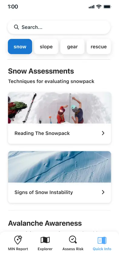
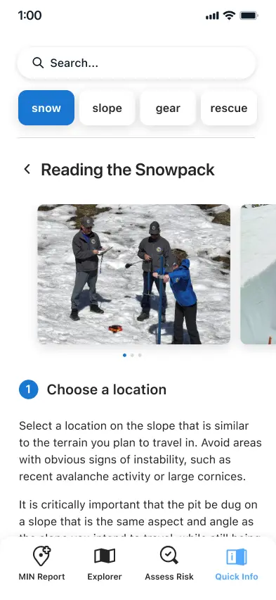
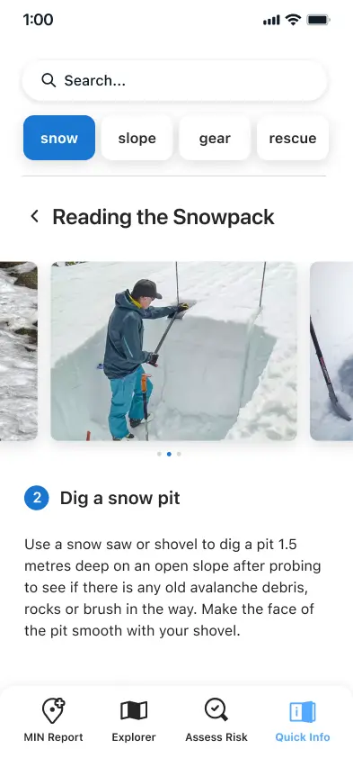
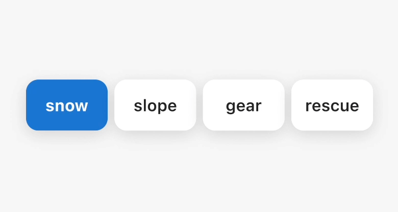
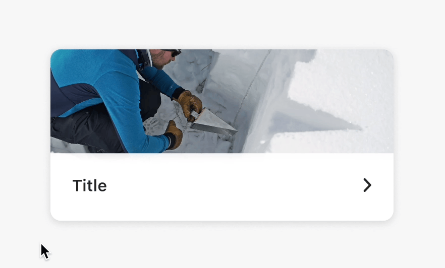
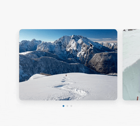
We established four categories of content in the Quick Info section we created for the AvCan mobile app: Snow, Slope, Gear, and Rescue, accessible in the top navigation bar. The specific example shown is the Snow section, which includes a list of interactive cards focusing on safety content centering snow and avalanches specifically. When the card Reading the Snowpack is tapped on, it directs the user to a navigational carousel of images and written content relevant to the topic. All textual content is derived directly from existing Avalanche Canada resources gathered from relevant online sites.
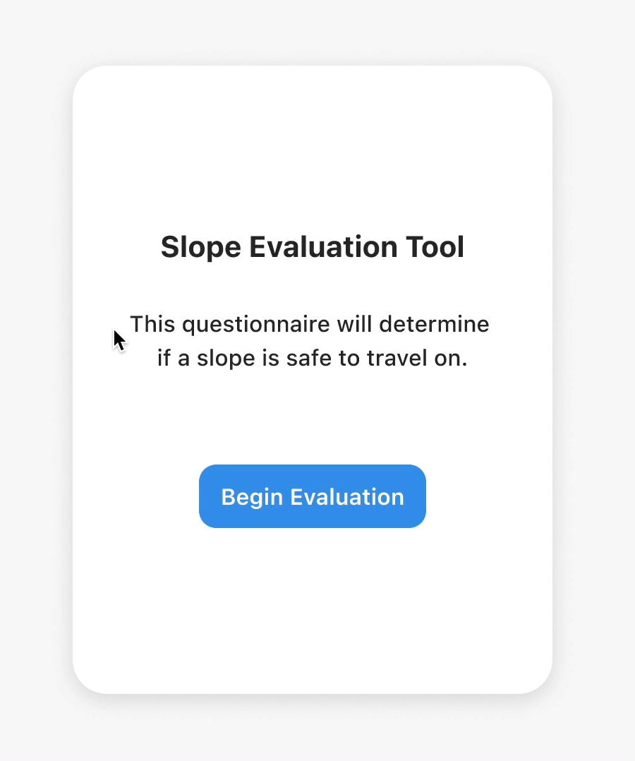
The Risk Assessment feature assisted users in better understanding the potential danger of certain slopes while out in the backcountry. Based off of an existing slope risk assessment available in Avalanche Canada's online safety guides, we crafted a yes/no mobile questionnaire experience.
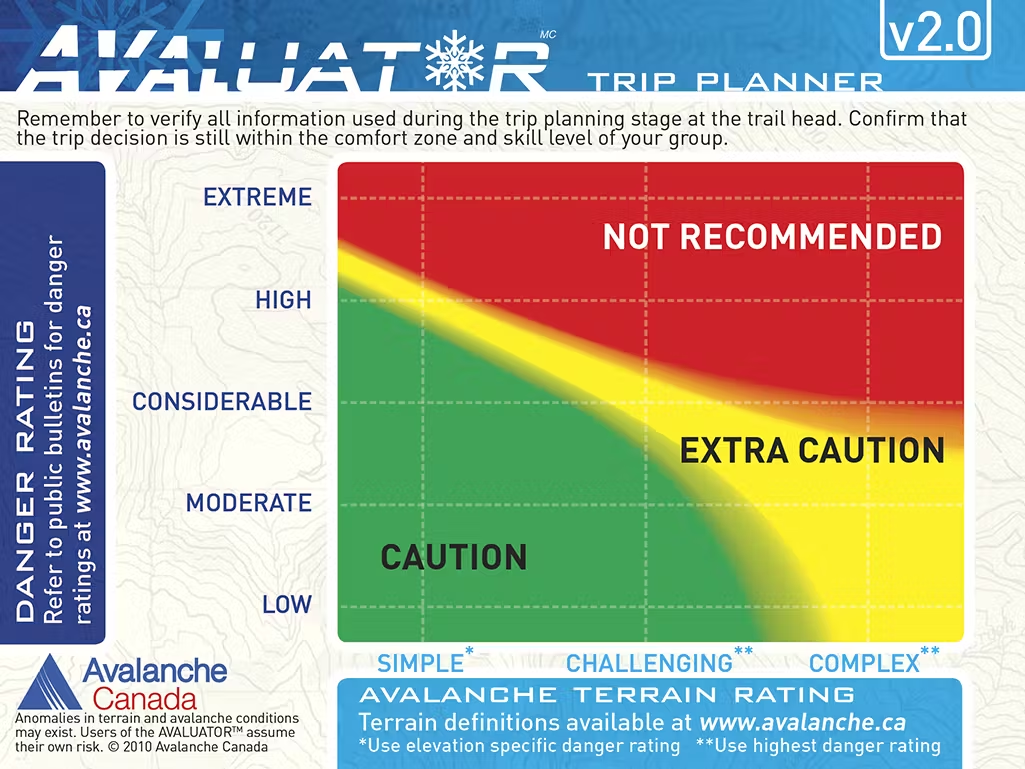
The Avaluator was created by Avalanche Canada to assist backcountry enthusiasts in making safer decisions when venturing into avalanche terrain.
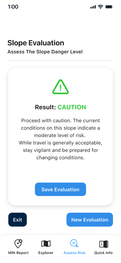
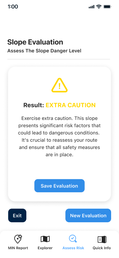
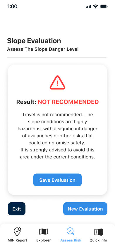
The potential slope evaluation results based off of user input.
My main role and priority throughout this collaborative project was to develop and design the components and visual guides for the design system, to define the visual and functional architecture of the Quick Info and Risk Assessment sections we proposed for the AvCan app. Each component was maintained in a Figma component library.
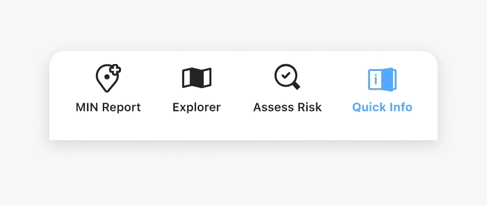
The navigation bar fixed to the header of the Quick Info section consists of four buttons to navigate between the specified sections.
The bottom bar component consists of the CTAs (call-to-action) necessary for the user to navigate through the AvCan app.
The main page card component is accessed within the main pages of the Snow, Slope, Gear, and Rescue categories of the Quick Info section.
The carousel card organizes text and image content.
This component is used specifically for the Risk Assessment section. It contains content relevant to the questionnaire for assessing slope safety.
Avalanche Canada has an existing colour palette, which was referenced for the blue accent tones that are used throughout all of the components and UI designs.
Avalanche Canada's current colour palette. Not derived from any official branding materials, but from analyzing the existing AvCan app.

Our colour palette.

SF Pro is Apple's default font for mobile applications. The minimum font size used was 16px, per recommended WCAG guidelines.

The Quick Info section presents content centered on recommended safety precautions, structured as brief yet essential refreshers for backcountry endeavors in avalanche-prone terrain.
The Risk Assessment section consists of a questionnaire, which is used as a tool to assess the potential safety risk associated with the slope the user is observing.
There is a significant level of risk when it comes to navigating the snowy backcountry. There were 12 recorded avalanche deaths in the recent 2022-2023 winter season (BC Coroner's Service, 2023). There is minimal margin for error - even when considering the fact that everyone accessing the backcountry is expected to have the necessary experience, skills and training, ensuring safety and awareness at all times through an offline, informational resource is crucial.
The impact of incorporating the additional Quick Info and Risk Assessment sections into the AvCan app is found in its support of the objective of expanding the AvCan app to better ensure the safety and knowledge of backcountry enthusiasts. This project exercised and further established my skills in creating Figma-based components, and fleshing out a cohesive design system. Consistency in the visual language, patterns, and interactions within a product is crucial to the overall experience of the user. The ease in which they navigate through the app ensures their understanding of safety-centred information.